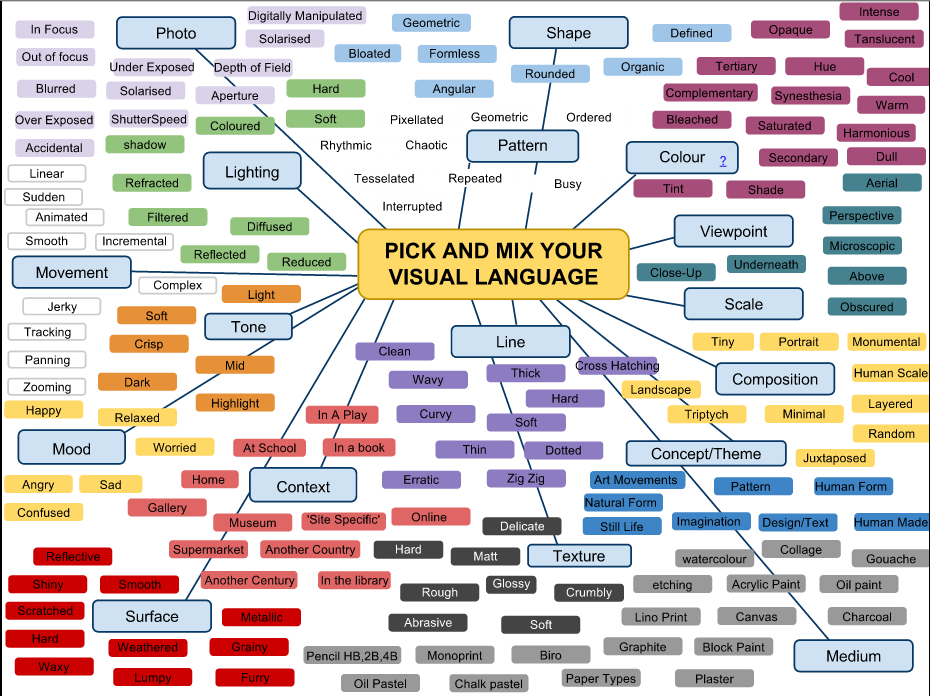
The Formal Elements
|
Particularizing "White Fence" beyond which the seeming
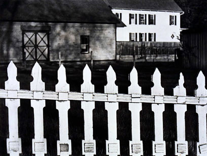
eehoes of barn, house, bright light flat on foursquare far building while in closer view shades darken the faint ground. Yet fence as image or word, white or black, or where place the person, the absent, in this ring of focus? I come closer, see in there the wistful security, all in apparent place, the resonant design, diamond, the dark/light, the way all plays to pattern, the longed for world of common facts, Then this fence again, as if pasted on, pushes out and across, a static, determined progress of detailing edges, American, an odd reasons so forced to be seen. It cannot accommodate, cannot let get past unaffected, any, must be "White Fence". - By Robert Creeley |
|
Annotations
- LIGHT & DARK & SHADE & SHADOW
- NIGHT & DAY & EVENING & AFTERNOON & MIDDAY & MORNING
- SOFT & HARD & FLOPPY & ROCK
- LOUD & QUIET & TONE & NOISE
- STILL & MOVEMENT & MOTION
- STRAIGHT & RIDGID & ZIG ZAG & BEND
- CLOSE-UP & WIDE SHOT & ZOOM
- IN FOCUS - OBSCURED & OUT OF FOCUS & UNCONCENTRATION & CONCENTRATION
- MINIATURE & BIG SCALE & LARGE
- WRINKLED & SMOOTH & OLD & YOUNG
- UP & BELOW & DOWN & ABOVE
- COMPLEXITY & SIMPLICITY & CRAZY & COMPLICATED
- OPEN & SHUT & BARRIER & LOCKED & BARRED
- COMPACT & FREE & SPACE
- LUXURIOUS & UNCOMFORTABLE & CALM & COMPOSED & AWKWARD
- TRANSPARENT & OPAQUE 7 TRANSLUCENT
- HIDDEN & EXPOSED & REVEALED & DISCOVERED & DONUT
- RED & GREEN & COLOURS & CONTRAST
- FLAT & ROUND & BUMPY
- MULTIPLE & SINGLE & TRIPLE & DOUBLE & QUDRA & DIVIDE & BACTERIA & DISEASE
- BRIGHT & DIM & DARK
- ORGANIC & GEOMETRIC & ARTIFICIAL & POLLUTION & FAKE & MATHEMATICAL & NATURAL & BIOLOGICAL & ORGANISM & CHAOTIC
- BLACK & WHITE & DULL & COLOURS & YING YANG & EQUALITY & HEAVEN AND HELL & GOOD AND EVIL
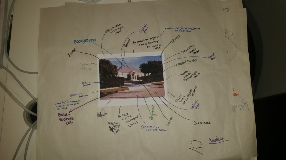
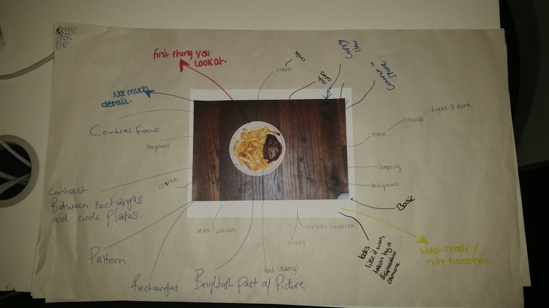
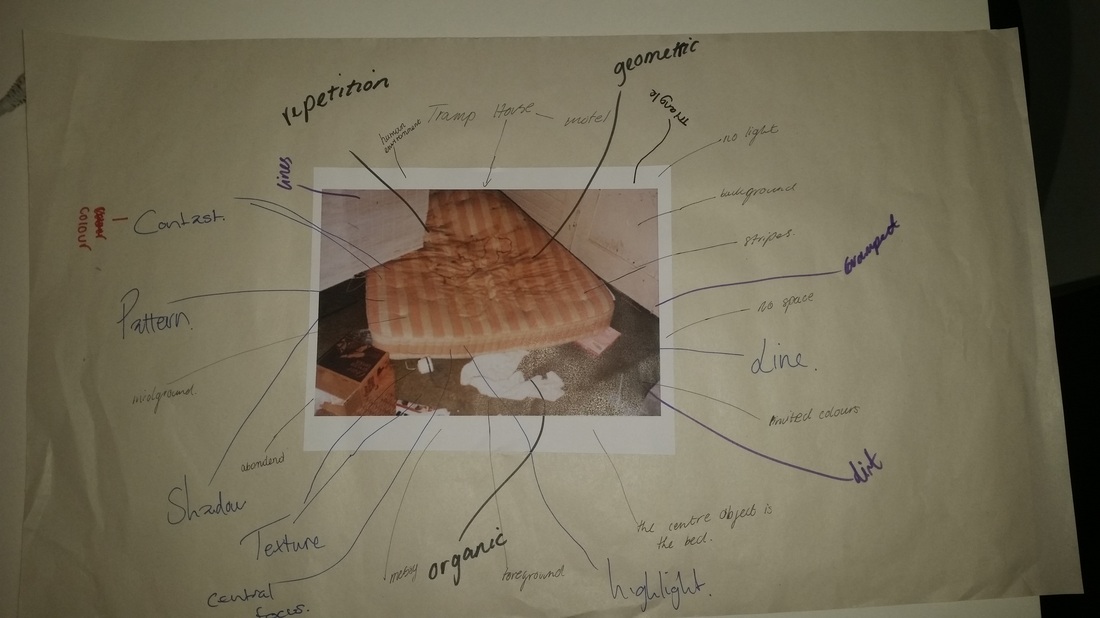
Image Set #1
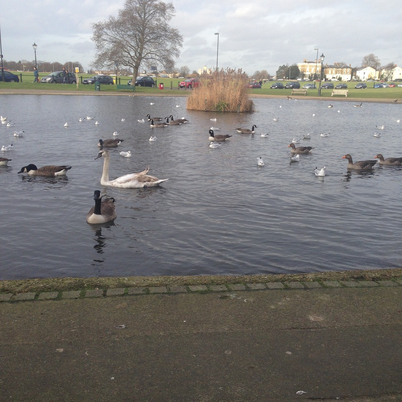
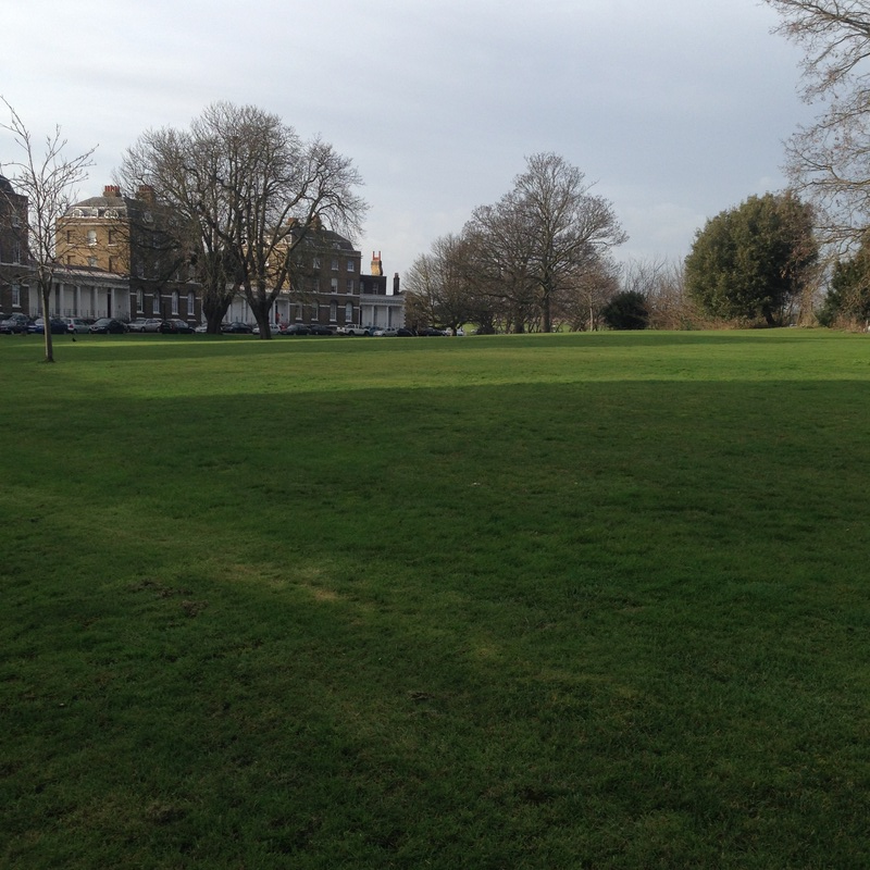
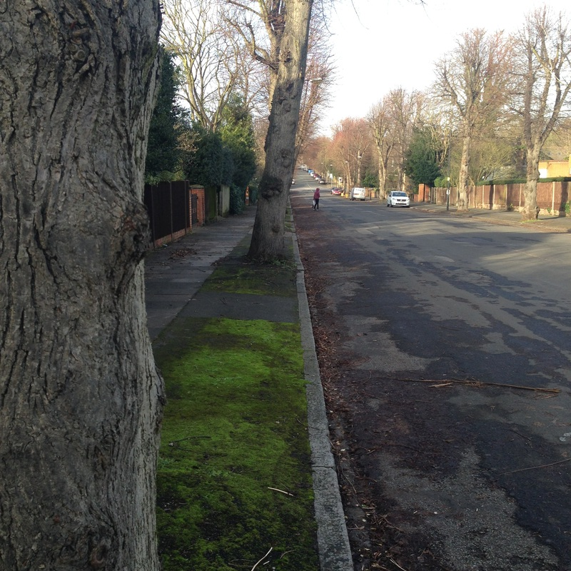
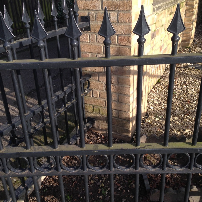
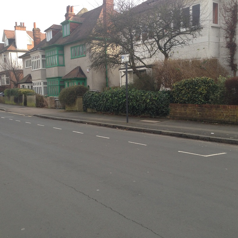
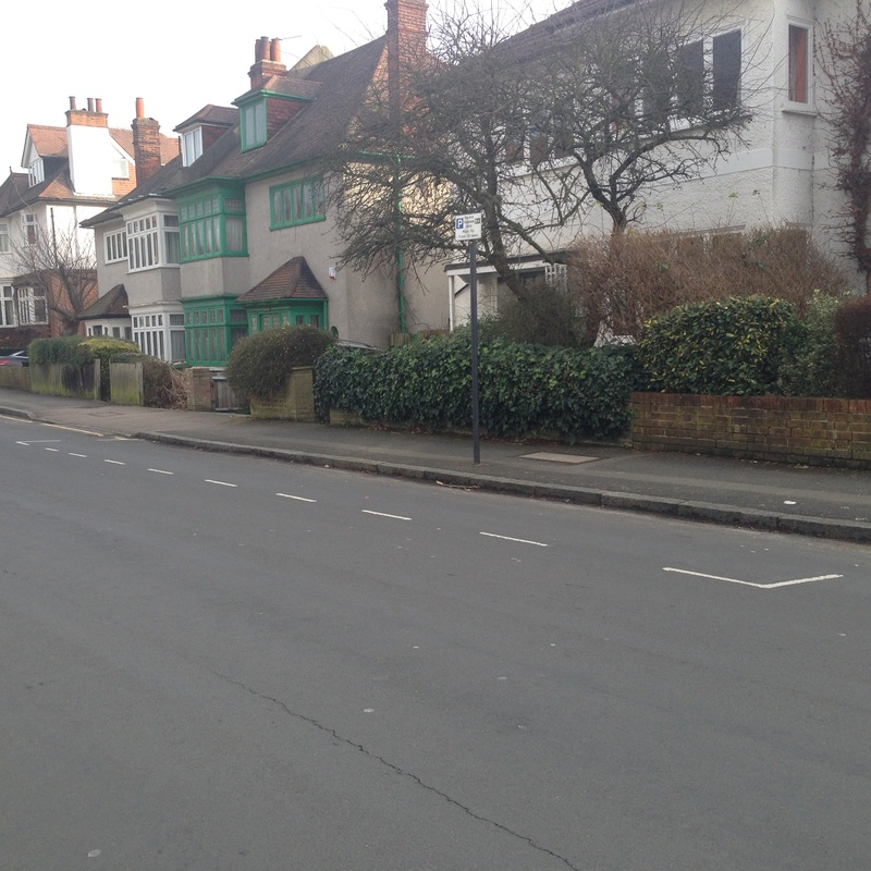
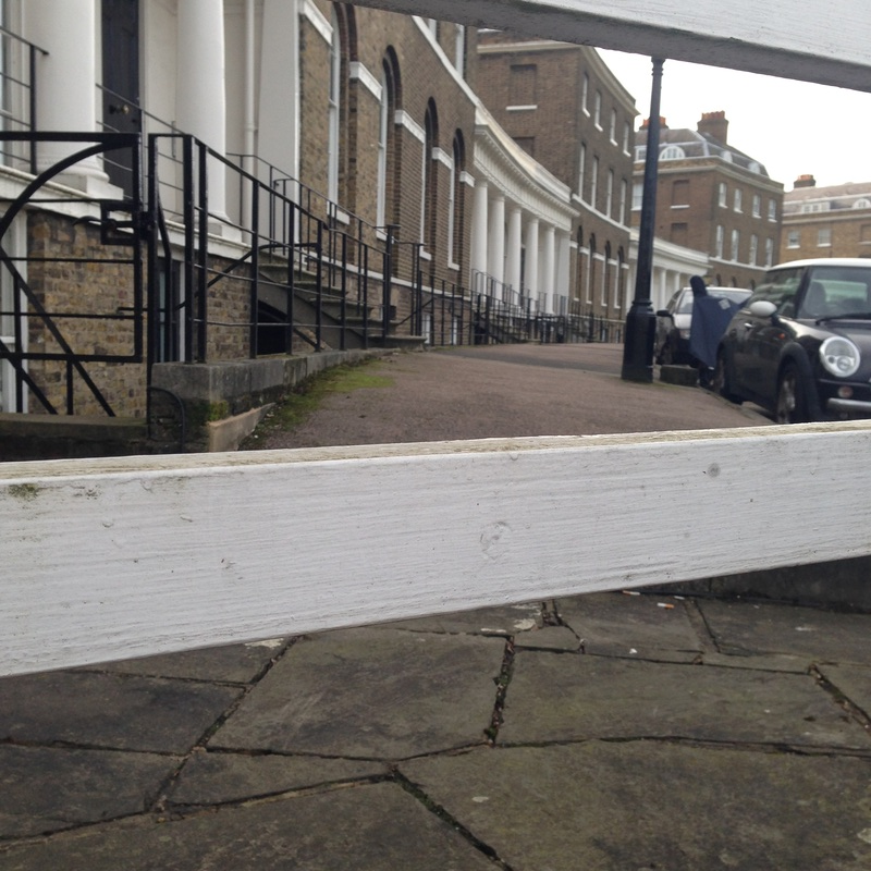
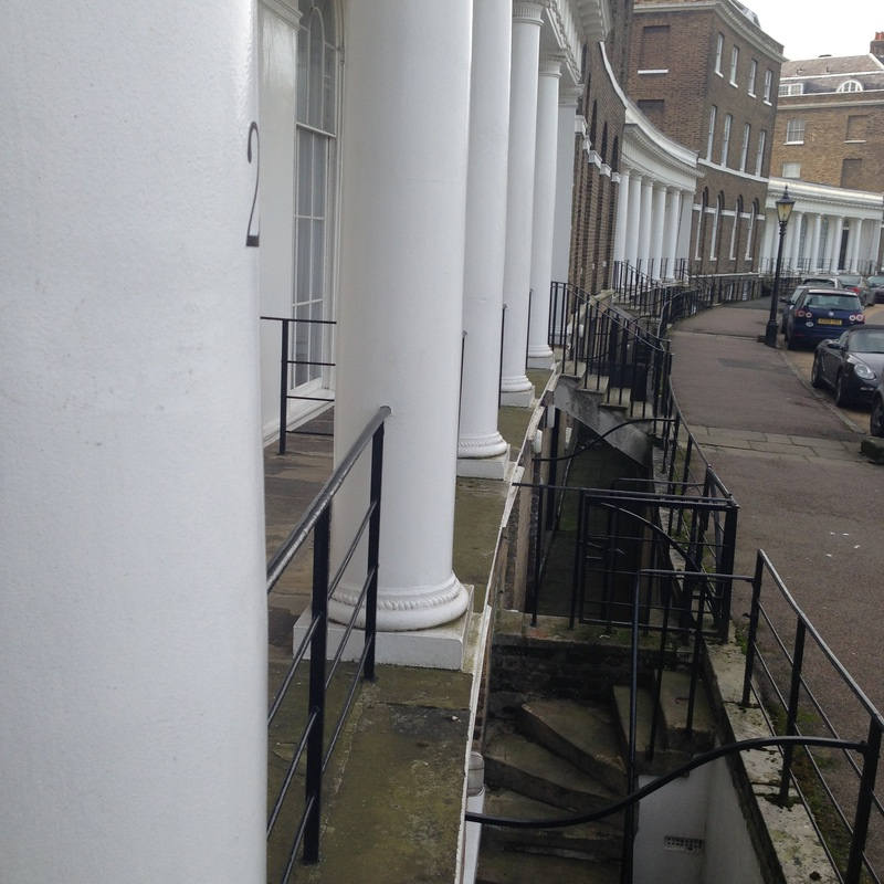
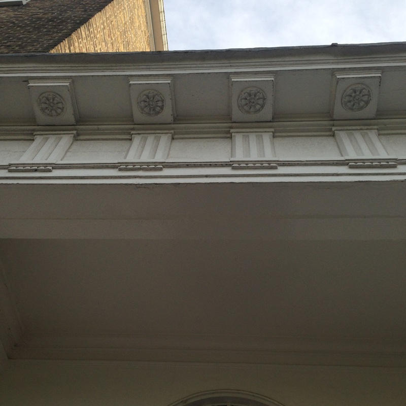
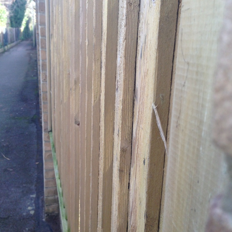
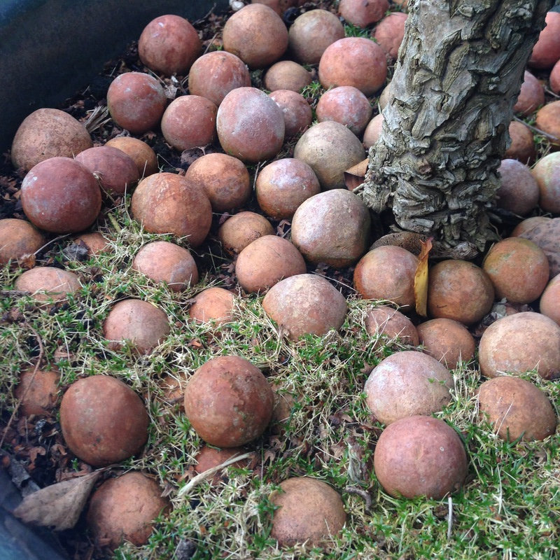
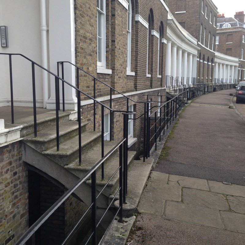
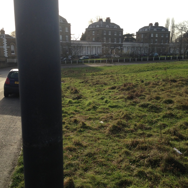
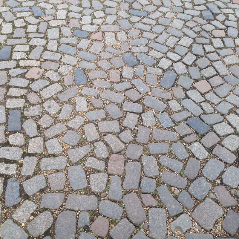
The images above are my first image set. When I went out to take these pictures I tried to focus on the formal elements, which are Focus, Light, Line, Repitition, Shape, Space, Texture and Tone. I mostly tried to focus on repition and space.
Best Images
In my first image I focused on the use of Repatiton and perspective which is one of the formal elements
|
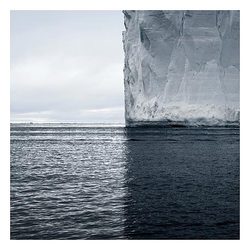
David Burdeny shows the the theme of contrast by the focus on the iceberg in the background of the image. The focus of the iceberg makes this image by David Burdeny stand out a lot because it is the only object in the image. As you can see in the image of the left there is a significant amount of highlights and shadows throughout the whole of the image. For instance on the left hand side of the image it is a lot lighter and has more highlights than the other half of the image. On the right hand side of the image, there is a lot of shadows not only on the water but also on the main object which is the iceberg. Looking at this image it looks like it is mid day because the shadow line is down the middle of the image. In this image there is a dominate light straight down the middle which creates a dominate line down the middle of the photo. However there is less dominate lines on the iceberg and also on the water. There is a lot of repetition through out this image of the waves and the movement of the waves in the image. There is also repetition of the iceberg of the different shapes on the iceberg. In this image mostly everything is three dimensional which makes this image stand out a lot and catches the audience's attention. The iceberg is three dimensional because you can see the shapes and edges on it. Futher more the clouds are also very three dimensional because the edges of the clouds. In this image there is a lot of space of the left hand side of the image, however that space is taken up by the clouds in the background. In this image there is a lot of texture on the iceberg and also the texture of the waves in the bottom half of the image. If I could touch the iceberg it would feel rough and cold. In this image there is a lot of tone, for example on the right hand side of the image there is a lot of dark tone of the iceberg and the waves. There is a lot of mid tones in the middle of the iceberg. There is not a lot of colour in this image apart from Grey, white and blue.
|
|
|
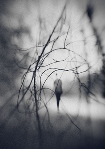
Looking at this image, the areas that appear the sharpest is the lines representing the branches leaving the background quite blurred and misty. The highlighted areas that I noticed from observing the image is very directly central to the image whereas the darker areas remain around the edges. I could guess the time of the day the photograph was taken was during a foggy morning. The natural light appears very soft like a painting rather than being harsh as the background particularly comes across patchy and blended in with tones. The lines are very thin and dainty but however there is one dominant line that is curved and intertwined with other branches going across the image. The repetition accorded within this image is the different lines of the branches going in different angles and positions. This creates a pattern looking quite abstract due to the lines not being as simply clear to see what the pattern represent from a close up view. In particular, the photograph doesn't show much shapes going on, whereas instead it's more based on the contrast in addition to the colour. The lines seem dimensional from the colour tone of the branches in contrast the highlight of the background. From the space in this image it has several negative spaces that are not over crowded with objects. The image seems shallow, dull and boring to look at because it hasn't got a lot of colour, it's very simple and also doesn't say much about the image from what is shown. If I was to touch the surface of the photograph I could imagine it to be quite smooth and soft. At first the tone was the most recognized eye catching statement of the image which represents a range of mid-tones in different surrounding areas to create the contrast. The colours seem dull and not very colourful but however shows a major contrast to a high quality.
|
|
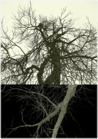
This image of a abstract tree shows the theme of contrast by the more focused area of the main part of the tree. As you can see on the image on the left is that the bottem half of the photo is more on focus and stands out a lot more than the top half of the image. This image also shows the theme of contrast through the use of light. As you can see there is a lot of light in the top half of the image which is also a burn out, which really catches the lookers eyes. There is also quite abit of light in the bottem half of the image where the branches are really bright and the background is very dark. In the image there is a lot of dominate lines on the main part of the tree and there is very thin lines on the outer branches of the tree. There is also a lot of repition in the image of the branches and the main part of the tree. The main branch in the image is three dimensional and makes the branch stand out a lot, however the smaller branches around the main branch are two dimensional and do not stand out as much as the main branch. There is a lot of space in the bottem half of the image where there is not a lot of branches, however there is no space in the top of the image and shows the contrast of the image. There is a lot of texture on the main part of the branch which is in a lot of detail. In this image there is alot of tone in the image, for example as you can see in the top half of the image the branches are black and the background is white, however in the bottem half of the image the branches are white and the background is black. In this image there is not alot of colour only black and white shades.
|
|
|
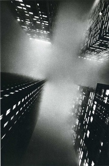
Ernst Haas work has shown the theme of contrast by taking the picture from worms-eye view. The reason why I think he has taken the image like this, is because it gives it a very interesting scary/mysterious looking image. I really like the way he showed contrast through the use of the light coming from the building's in each corner of the picture. I find it very interesting how he used contrast with the focus of the different building. As you can see in the image , the bottom of the buildings our in focus, however the top of the building's are not in focus which gives it a very interesting look.
|
